Three of Itten’s Color Contrasts (session 10)
Tuesday, November 9, 2010
1. Digital: I used Kuler to make this digital version of warm/cold contrast
2. Photographed: Contrast of Saturation
3. Painted: Simultaneous Contrast
1. Digital: I used Kuler to make this digital version of warm/cold contrast
2. Photographed: Contrast of Saturation
3. Painted: Simultaneous Contrast
I love making patterns! I was soooo excited for this assignment! Enjoy my first round of B&W patterns:
OK, so I know that I have just posted about Coco (Conan), but, he has a new AMEX commercial that is amazing for a few reasons.
1. Look at the colors, they are beautiful.
2. Conan is in India, anyone who knows me has heard me talk incessantly about my trip to India and how it was the coolest place ever.
3. Pause the video at 1min 32 seconds… this is the part of the Monkey Temple in Jaipur, below is one of my favorite pictures I took while in India, and right below it is a screen shot of the paused commercial!
Now, look at the screen shot from the commercial, SAME PLACE!!!!
Finally, here is the video of the commercial… it is super funny and worth watching!
I am obsessed with repeating patterns! I have been eagerly awaiting this assignment! so here are some pictures of found patterns I had in the house and of some famous ones from the internet.
1. Bolt 44 is a cool textile website, and it is affordable as well!
2. French Paper is one of my favorite companies ever… they package things so well, and they give away amazing posters and sample books. This pattern is from one of their sample books.
3. House Industries is a super cool type foundry… this is the front and back cover of one of their type sample books… neat typographic pattern!
4. Ikea sells some amazing textiles… I had this in the house and I threw it on the scanner!
5-7. The next three are some beautiful paper that I bought at Pearl River down in SoHo.
8. Josef Frank is a famous pattern designer… here is one of his
9. I know I have blogged about Marimekko in the past but for me they are the best!
10-11. Lastly, I have two samples of patterns by another famous artist, Stig Lindberg
Logo 1: Asprey
I spent a lot of time thinking about this post, hence the lateness! My first stop was not the web but rather my library. I poured through my copies of Logo Design and Logo Design 2, however unfortunately I did not come across anything that really caught me.
Next, I ventured over to the Pentagram website because I have such admiration for their marks. To my surprise, and I had not even thought about this before I realized that all the logos on the Pentagram site are in their stripped down B&W version. None the less I continued flipping through some and I came across this logo:
My eyes immediately fixated on the word luxury and on a whim I thought I would check the company’s website to see how they treated the logo. Well, my hunch was correct, look how the logo appeared on the Asprey site:
Look at the beautiful violet texture that is the background of the site! This must mean that violet is really another word for luxury! Research done! No, not really, but this was a nice discovery.
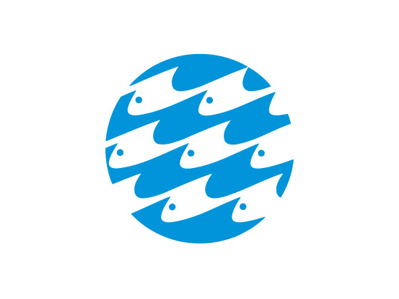
Logo 2: The National Aquarium (in Baltimore)
To me, some of the best logos require no words at all and simply rely on color and form to communicate their message. Being from Baltimore I had to highlight one of our famous logos… famous in the sense that the world renowned firm Chermayeff & Geismar are the brains behind this logo.

I love the use of negative space, and the sense of movement that the fish have. The logo is nicely packaged in a cool blue making it perfect!
3. Coolo Frozen Yogurt
Lastly, I wanted to find a logo that used color in a clever way to highlight the brand. This mark comes from the Deborah Adler Design Studio. She became famous in the design world for her re-design of the medicine bottle known as the ClearRx system. With this logo for Coolo Frozen Yogurt the way in which pastels are used and the letters make up the contents of the cone is super clever.